제품디자인회사 | DENTIUM Dental Table

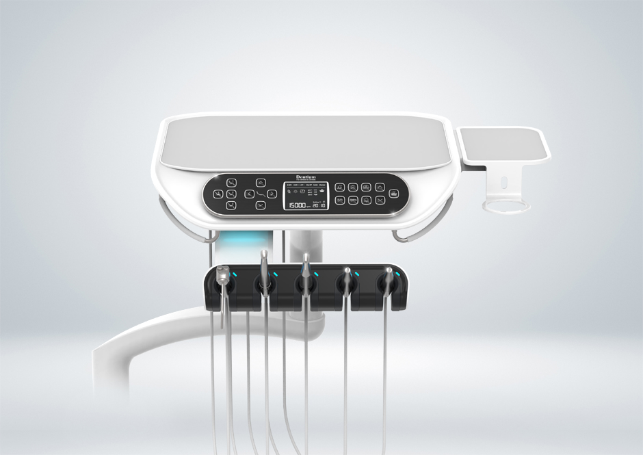
덴티움 덴탈 체어에 적용되는 닥터 테이블은 의료기기의 기능성과 함께 조형미를 강조한 디자인으로, 훈스튜디오의 인간 중심 디자인 철학이 고스란히 반영된 작품입니다. 치과 진료 환경은 정밀한 기기 사용과 빠른 업무 동선이 요구되는 만큼, 해당 제품은 기능적 효율성과 감성적 안정감을 동시에 제공할 수 있도록 설계되었습니다. 특히 의료 환경에서의 조형성은 단지 외형의 아름다움뿐만 아니라, 사용자의 심리와 진료 흐름에도 직접적인 영향을 주기 때문에, 디자인 단계에서부터 직관성과 시각적 안정감을 고려한 형태 언어를 중심에 두었습니다.

이 제품의 가장 큰 조형적 특징은 부드러운 곡선의 조형미와 상승감 있는 전체 실루엣에 있습니다. 테이블 상단은 하단 지지부에서 자연스럽게 솟아오르는 듯한 형태로, 공중에 떠 있는 듯한 가벼운 인상을 줍니다. 이러한 형태적 상승감은 의료진에게는 적극적이고 역동적인 이미지를, 환자에게는 세련되고 위생적인 인상을 전달합니다. 특히, 직선적인 기계 디자인에서 벗어나 곡선을 주로 사용함으로써, 전반적인 분위기가 부드럽고 친근하게 느껴지도록 구성하였습니다. 이는 치과라는 특수 환경에서 환자의 불안을 줄이고, 의료진의 피로를 덜어주는 간접적인 요소로 작용합니다.

상단 테이블 면은 기존 제품 대비 넓은 면적을 제공하여 다양한 기구를 안정적으로 배치할 수 있는 사용성을 확보하였습니다. 부드러운 조형미를 유지하면서도 실질적인 작업 공간을 넓게 확보함으로써, 기능성과 디자인이 조화를 이루는 구성입니다. 테이블 오른편에는 별도의 보조 트레이를 배치하여 소형 기구나 디지털 장비를 효율적으로 사용할 수 있도록 하였으며, 컵 홀더 등 실제 진료 상황에서의 편의 요소들도 일체형으로 통합하였습니다. 이러한 구조는 사용자 중심의 설계 사고를 바탕으로 하여, 실제 의료진의 사용 맥락에서 발생할 수 있는 다양한 시나리오를 충분히 고려한 결과입니다.

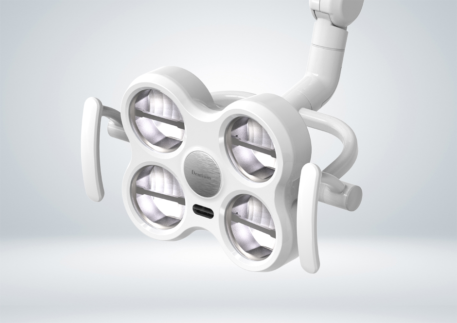
디자인 중심부에 위치한 디지털 디스플레이와 터치 컨트롤 버튼 패널은 전체 조형의 핵심 포인트로 기능합니다. 블랙 하이글로시 재질로 마감된 이 영역은 주변의 밝은 화이트 톤과 강렬한 대비를 이루며, 시선을 집중시키는 시각적 중심축의 역할을 합니다. 버튼 레이아웃은 대칭성과 간결함을 고려하여 배치되었으며, 각 아이콘은 직관적으로 설계되어 진료 중 빠른 조작이 가능하도록 하였습니다. 또한, 디스플레이는 고해상도의 정보를 선명하게 제공하며, 사용자 인터페이스는 불필요한 복잡함을 배제하고 직관적인 흐름을 제공하여, 사용자의 학습 부담을 최소화합니다.

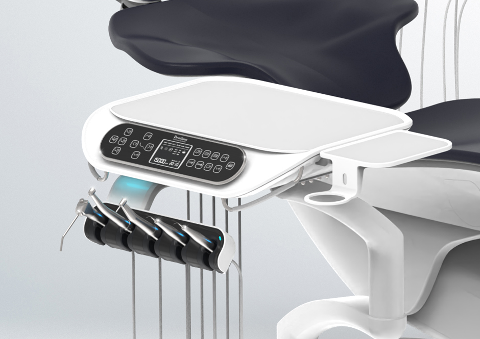
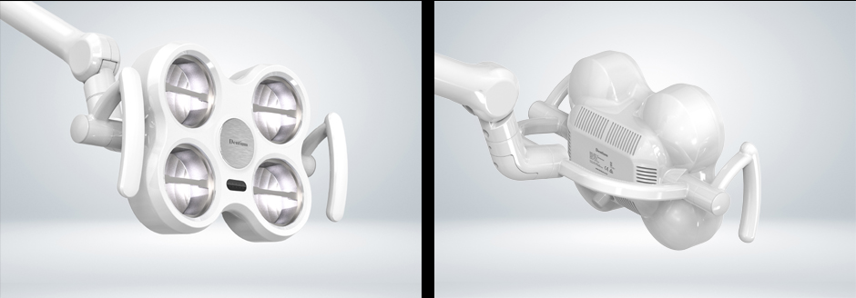
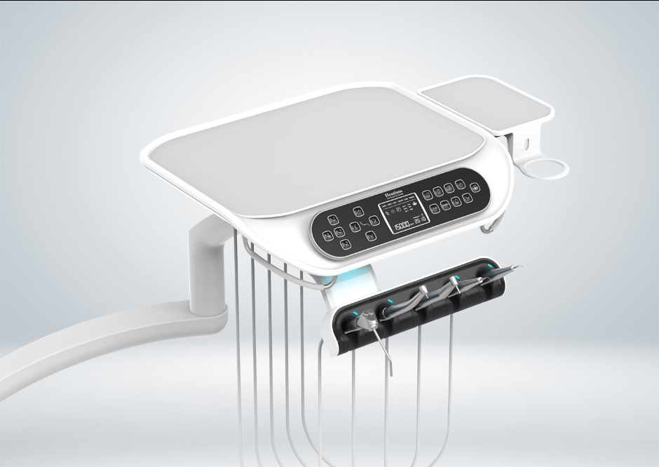
핸드피스 거치대는 사용자 중심의 유연한 각도 조절이 가능하도록 설계되어, 다양한 진료 자세와 손의 위치에 따라 최적의 각도로 사용하실 수 있습니다. 각각의 거치대는 고정된 틀에 얽매이지 않고, 개별적으로 움직일 수 있는 구조를 취하고 있으며, 사용자의 동선과 손의 높이를 고려한 인체공학적 설계를 기반으로 제작되었습니다. 이러한 구조는 실제 진료 과정에서의 피로도를 낮추고, 더욱 효율적인 작업을 가능하게 합니다. 핸드피스 자체를 수납하는 공간 역시 부드럽고 견고한 라운딩 구조를 통해 외관과 기능 모두에서 고급스러움을 전달합니다.

제품의 재질 구성은 위생성과 감성적 만족감을 동시에 충족할 수 있도록 구성되었습니다. 상판은 내스크래치성이 높은 고광택 소재로 마감되어, 의료 공간에서 요구되는 청결 유지가 용이하며, 반사광을 통해 공간의 고급스러운 이미지를 연출합니다. 특히 전체적으로 밝은 화이트 톤을 기반으로 하되, 사용자의 시선을 집중시킬 필요가 있는 조작 영역에는 블랙 포인트를 주어, 기능적 강조와 심미적 분리가 동시에 이루어지도록 하였습니다. 이러한 색채 대비는 기능별로 구분된 시각적 계층을 형성하며, 사용자가 복잡한 기능을 보다 쉽게 인지할 수 있도록 돕습니다.

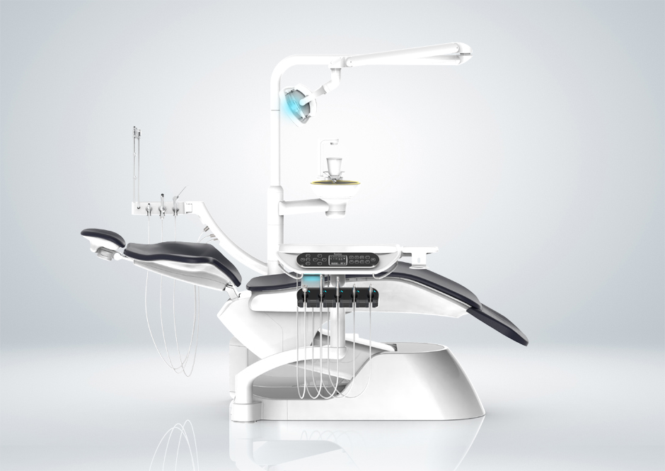
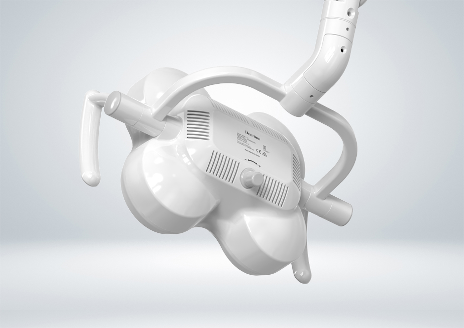
측면 및 하단 구조 또한 기능과 조형의 균형을 고려하여 디자인되었습니다. 유선형의 받침부는 기기의 무게감을 분산시키며 안정된 인상을 제공하는 동시에, 전체 구조가 공중에 떠 있는 듯한 인상을 유지할 수 있도록 비례감을 조절하였습니다. 또한 하단에서 올라오는 각종 케이블과 기계적 연결 요소들은 모두 본체 내부로 수납되거나 후면부로 정리되어, 의료 공간에서 불필요한 시각적 노이즈를 최소화합니다. 이는 훈스튜디오가 추구하는 클린 & 오거나이즈드 디자인 원칙의 일환입니다.

결론적으로, 본 닥터 테이블 디자인은 단순한 의료기기 이상의 의미를 지니고 있습니다. 훈스튜디오는 의료 현장에서의 실제 사용성에 대한 깊은 이해를 바탕으로, 조형적 아름다움과 기능적 효율성을 균형 있게 담아낸 결과물을 제시하였습니다. 유기적인 곡선미와 상승감을 담은 형태, 직관적인 인터페이스, 위생적이면서도 감성적인 소재 구성 등은 이 제품이 지향하는 디자인 가치를 명확히 보여주는 요소들입니다. 이는 의료 환경의 품격을 높이고, 사용자의 진료 경험을 더욱 정교하고 쾌적하게 만드는 데 기여하며, 기능성과 감성, 기술과 조형이 유기적으로 융합된 대표적인 의료 디자인 사례로 평가받을 수 있을 것입니다.

The Doctor Table designed by HOONSTUDIO for Dentium’s dental chair exemplifies a seamless integration of sculptural aesthetics and functional usability, reflecting a deep understanding of the clinical environment. The design embraces a soft, upward-flowing silhouette that conveys a sense of lightness and precision. Its elegant curves create a friendly and calming atmosphere for both practitioners and patients, while the expansive tabletop offers practical space for various instruments without compromising the form’s visual harmony.

A central design element is the digital display and control panel, highlighted by a high-gloss black finish that contrasts with the surrounding bright tones. This provides a visual focal point while maintaining intuitive and symmetrical button arrangements for efficient use. The interface is designed to be instantly understandable, minimizing cognitive load during procedures.

The handpiece holders are designed for flexible angle adjustment, allowing dentists to adapt the tools’ orientation to their specific workflow and posture. The ergonomic structure reduces fatigue and enhances precision. The combination of soft-touch surfaces, hygienic materials, and concealed cabling supports a clean, organized look and reinforces the premium feel of the device.

Overall, the Doctor Table is a refined example of human-centered design, where elegance meets performance in the clinical setting, enhancing both user experience and the professional image of the dental space.

제품디자인회사 | DENTIUM Dental Lighting

덴티움 덴탈 체어용 조명은 의료 환경이라는 기능 중심의 공간 속에서, 그 자체로 하나의 조형적 존재감을 드러내는 감성적 오브제를 지향하며 디자인되었습니다. 훈스튜디오는 이 제품을 단순한 조명 기기가 아닌, 공간과 사용자의 감성을 연결하는 매개체로 해석하였습니다. 치과라는 특수한 환경은 긴장과 불안을 동반하는 공간이기에, 조명의 형태와 표면, 색채, 그리고 조형적 리듬은 사용자에게 안정감과 편안함을 제공하는 중요한 요소로 작용합니다.

디자인의 출발점은 “유기적인 대칭”에 있었습니다. 전면에 배치된 4개의 라이트 모듈은 완벽에 가까운 균형을 이루며 대칭을 이루고 있으며, 이는 시각적으로 안정된 구성을 제공합니다. 이 네 개의 원형은 단순히 나열된 조명 소자가 아니라, 하나의 유기체처럼 연결되고 흐르도록 설계되었습니다. 각 모듈은 곡선의 흐름을 따라 자연스럽게 이어지며 중심부를 향해 수렴되는 시각적 리듬을 형성합니다. 이러한 대칭적 구조는 인체의 균형감각과도 맞닿아 있으며, 치과 진료 상황에서 환자와 의료진 모두에게 시각적 신뢰감을 제공합니다.

제품의 전체적인 실루엣은 곡면이 강조된 유선형 디자인을 따르고 있습니다. 날카롭거나 기계적인 선을 지양하고, 모든 엣지는 부드럽게 처리하여 친화적이고 감성적인 인상을 줍니다. 조명 장치라는 기계적 성격의 제품이지만, 그 안에 인간 중심의 조형 언어를 담아냄으로써 기능과 감성의 경계를 허문 디자인입니다. 제품 전면부의 중심에는 브러쉬드 메탈 재질의 원형 인서트가 삽입되어 있으며, 이는 전체적으로 하이글로시한 표면과 대비되어 포인트 요소로 작용합니다. 이러한 재질의 대비는 단순한 장식이 아니라, 고급감과 함께 시선을 중심으로 모아주는 시각적 장치로서의 역할을 수행합니다.

핸들은 양쪽에 배치되어 있으며, 제품의 조형적 흐름에 맞춰 유기적으로 설계되었습니다. 단순한 부착물이 아닌, 전체 디자인의 일부로서 자연스럽게 통합되어 있으며, 사용자가 조명을 조작할 때 촉각적 만족감과 함께 조형적인 일관성을 경험하실 수 있도록 하였습니다. 후면 또한 기능적인 요소들이 모여 있는 공간이지만, 통풍구와 조절 다이얼, 각종 라벨링 등의 요소들이 조화롭게 배치되어 시각적인 혼란 없이 정돈된 이미지를 형성합니다. 특히 통풍구 디자인은 단순한 슬롯 배열이 아닌 곡면을 따라 리듬감 있게 구성되어 있어, 후면에서도 조형적 완성도를 유지합니다.

색채는 전체적으로 의료 환경에 적합한 청결한 이미지를 강조하는 화이트 톤으로 구성되었으며, 하이글로시 마감은 공간 내의 조명과 반사되어 고급스러운 광택감을 연출합니다. 이러한 표면 마감은 감성적 만족감뿐 아니라 위생적인 관리 측면에서도 적합한 선택이었습니다. 제품의 전반적인 조형 언어는 직선보다 곡선, 각보다 볼륨, 기계성보다 유기성에 집중되어 있으며, 이는 훈스튜디오가 의료기기 디자인에서 지향하는 인간 중심의 디자인 철학을 잘 드러냅니다.

결과적으로 이 덴탈 체어용 라이팅은 단순한 조명이 아니라, 하나의 조형 언어로서 공간의 품격을 높이고 사용자에게 심리적 안정을 제공하는 역할을 합니다. 훈스튜디오는 기능적 요구사항을 충실히 반영하면서도, 형태를 통해 정서적 경험까지 고려한 디자인 솔루션을 제안하였습니다. 이 제품은 의료기기의 기능성과 예술적 감성을 융합한 대표적인 사례로, 기술과 디자인, 인간의 경험이 유기적으로 결합된 결과물이라 할 수 있습니다.

Design Narrative for Dentium Dental Chair Light

The Dentium dental chair light was designed with the intention of going beyond a functional medical device, transforming it into a sculptural object that harmonizes with the emotional and spatial dynamics of a dental clinic. HOONSTUDIO approached this project not merely as a technical challenge but as an opportunity to create a medium that connects users to their environment through form, texture, and visual rhythm.

At the core of the design lies the concept of “organic symmetry.” The four circular light modules on the front are arranged in a perfectly balanced, symmetrical layout, evoking a sense of visual stability. Each unit is not isolated but seamlessly integrated into a fluid structure that draws the eye inward to the center. This soft convergence mirrors natural forms, promoting a subconscious sense of harmony for both patient and practitioner during clinical procedures.

The overall silhouette of the light embraces a streamlined, curved geometry. All edges are softened to eliminate any sense of sharpness or cold mechanical impression. This approach ensures that the light fixture feels approachable and comforting—a critical design consideration in the anxiety-prone context of dental treatment. At the center of the front panel, a brushed metal insert provides a focal point, subtly contrasting with the high-gloss white finish that envelops the rest of the body. This material juxtaposition not only enriches the visual texture but also underscores the precision and quality of the product.

Handlebars are placed symmetrically on both sides, shaped to follow the overall flow of the form. Rather than appearing as add-ons, they are fully integrated into the product’s design language, offering ergonomic functionality while maintaining sculptural consistency. On the rear side, functional elements such as ventilation slots, adjustment dials, and technical labels are carefully aligned to create a clean and ordered appearance. The ventilation design, in particular, features a rhythmic arrangement along the curvature, adding aesthetic depth even to the back of the device.

The product is rendered in a pristine white tone, ideal for medical settings, enhanced with a glossy finish that reflects ambient light to emphasize cleanliness and sophistication. This surface treatment is not only visually refined but also supports hygienic maintenance.

Ultimately, this lighting fixture stands as a refined object that enhances the clinical space through its sculptural presence and emotional sensibility. HOONSTUDIO’s design bridges the gap between technical functionality and human-centered aesthetics, offering a holistic solution that enriches the user experience. The result is a medical device that transcends its utilitarian role to become a thoughtful, integrated element of its environment.

제품디자인회사 | ARIBIO_Brain Vibroacoust

디자인으로 구현한 치매 관리의 새로운 가능성 – 아리바이오 ‘헤르지온(Herzion)’

고령사회로 접어든 대한민국에서 치매는 단순한 질병을 넘어, 개인의 삶과 가족의 일상, 사회 전체에 영향을 미치는 중대한 과제로 부상하고 있습니다. 훈스튜디오는 이러한 시대적 과제에 대응하고자, 아리바이오와의 협업을 통해 ‘헤르지온(Herzion)’이라는 혁신적인 웨어러블 의료기기의 디자인을 맡아 진행했습니다.

‘헤르지온’은 약물 치료의 한계를 넘어서기 위해 개발된, 비약물 치료 기반의 저주파 음향·진동 자극 기기로, 사용자의 전두엽과 측두엽에 직접적으로 작용하여 인지기능 개선에 도움을 주는 기술을 기반으로 설계되었습니다. 훈스튜디오는 이 획기적인 기능을 담아내는 데 있어 단순히 외형적 아름다움이 아닌, 기술적 효과를 극대화하고 사용자에게 정서적 안정감과 신뢰감을 줄 수 있는 형태와 구조를 고민했습니다.

헤르지온의 핵심 디자인 키워드는 ‘일상성 속의 전문성’입니다. 사용자의 대부분이 중장년층이라는 점을 고려하여, 기기 자체가 부담스럽거나 인위적인 느낌을 주지 않도록 유려하고 친숙한 곡선 기반의 형태로 디자인을 전개하였습니다. 이마에 착용하는 형태의 밴드 구조는 단순하면서도 직관적인 인터페이스를 강조하였고, 장시간 착용에도 불편함이 없도록 200g의 가벼운 무게와 인체공학적 구조를 채택하였습니다.

디자인의 컨셉은 ‘조화와 자극의 균형’입니다. 인체에 작용하는 음향과 진동은 강렬하지만, 그 전달 방식은 부드럽고 자연스러워야 합니다. 이를 고려하여 외관에서는 의료기기 특유의 냉철한 이미지보다, 따뜻하고 신뢰감 있는 소재와 컬러를 선택하였습니다. 부드러운 촉감의 실리콘 밴드, 반사광이 적은 무광 마감, 심플하고 정제된 LED 인터페이스 등은 시각적 자극을 최소화하면서도 기능을 직관적으로 인식할 수 있도록 해줍니다.

헤르지온의 UI 연동 역시 디자인의 주요 고려 요소였습니다. 스마트폰과 블루투스로 연결되는 앱 기반의 조작 체계는, 비전문가인 사용자가 쉽게 조작할 수 있도록 단순한 인터페이스와 아이콘을 기반으로 설계되었습니다. 훈스튜디오는 제품과 앱 간의 통합적인 사용자 경험이 일관되도록, 색상 체계와 그래픽 스타일, 피드백 방식에 이르기까지 철저한 사용자 중심의 디자인 전략을 수립했습니다.

또한, 헤르지온의 디자인은 ‘심리적 거부감 최소화’라는 목표를 바탕으로 진행되었습니다. 특히 치매라는 단어가 주는 무게감을 덜기 위해, 기기의 형태와 착용 방식은 일반적인 웨어러블 디바이스와 크게 다르지 않도록 구성하였으며, 외부에서 쉽게 알아볼 수 없도록 패션 아이템처럼 자연스럽게 착용할 수 있도록 디자인되었습니다. 이는 사용자 본인의 심리적 안정과 동시에 주변 사람들의 시선에서도 부담을 줄일 수 있는 중요한 전략이었습니다.

훈스튜디오는 ‘기술을 입은 디자인’이라는 철학 아래, 헤르지온이라는 기기 안에 단순한 형태의 조합이 아닌, 사람의 일상과 건강을 깊이 있게 연결하는 디자인 해석을 담아냈습니다. 특히 의료기기의 영역에서 디자인이 단순한 외형 이상의 의미를 가지기 위해서는, 사용자의 감정, 사용 맥락, 제품의 신뢰성 등 다양한 요소가 함께 고려되어야 합니다.

아리바이오와의 긴밀한 협업 과정에서 훈스튜디오는 제품 초기 컨셉 스케치 단계부터 실사용자 인터뷰, 프로토타입 테스트, 앱 연동 UI 설계까지 전 과정을 함께 하며, 디자인이 단순한 외형이 아닌 사용성과 효과성을 증대시키는 핵심 역할을 할 수 있음을 다시 한번 실감했습니다.

결과적으로, ‘헤르지온’은 단지 기능성만으로 평가받는 의료기기가 아닌, 사용자에게 ‘희망’과 ‘회복’을 디자인으로 전달하는 매개체가 되었습니다. 그리고 이 여정 속에서 훈스튜디오는 디자인이 사회적 가치에 어떻게 기여할 수 있는지를 실질적으로 보여줄 수 있었습니다.

앞으로도 훈스튜디오는 기술과 사람, 환경 사이의 균형을 고민하며, 변화하는 사회적 요구에 부응하는 디자인 솔루션을 제시해 나갈 것입니다.

ealizing New Possibilities in Dementia Care through Design – The Design Story of Aribio’s ‘Herzion’

As Korea enters a super-aged society, dementia has become a critical issue that impacts not only individuals and families but the entire social structure. In response to this societal challenge, HOONSTUDIO collaborated with Aribio to develop the design of an innovative wearable medical device called “Herzion.”

Herzion is a non-pharmacological therapeutic device designed to go beyond the limitations of drug-based treatment. It operates by delivering low-frequency sound and vibration stimulation directly to the frontal and temporal lobes of the brain to support cognitive function improvement.

In designing this breakthrough device, HOONSTUDIO prioritized not only aesthetics but also the enhancement of technological impact and the creation of emotional comfort and trust for users. The goal was to craft a form that would intuitively reflect the device’s medical purpose while seamlessly integrating into users’ everyday lives.

Design That Blends Professionalism into Everyday Life

The core design philosophy of Herzion is “professionalism within everyday life.” Recognizing that the primary users are middle-aged and older adults, the design adopts smooth and familiar curves to avoid feelings of discomfort or artificiality.

The headband-style structure, worn across the forehead, emphasizes a simple and intuitive interface. To ensure comfort during extended use, the device features an ergonomic form and weighs only 200 grams, minimizing strain even for elderly users.

This thoughtful balance between professional functionality and domestic familiarity was essential in developing a product that users would willingly adopt and consistently use as part of their daily health routines.

A Form That Balances Harmony and Stimulation

The core visual concept centers around “balance between harmony and stimulation.” While the sound and vibration stimuli delivered by the device are powerful, the way they are administered must feel natural and non-intrusive.

To reflect this philosophy, HOONSTUDIO selected warm, approachable materials and soft colors, diverging from the typically clinical image of medical devices. The use of matte finishes with minimal reflection, soft-touch silicone, and a clean, minimal LED interface contributes to a calm, reassuring product experience while maintaining full functionality.

This harmony in form not only improves user compliance but also reinforces the emotional connection between the user and the device.

An Integrated User Experience Across Device and App

The integration between the physical device and its mobile application was another key focus of the design process. The Bluetooth-enabled app interface was developed to be as intuitive and user-friendly as possible, especially for non-tech-savvy users.

Icon-based navigation, minimal text, and simple operation allow users to operate the device confidently. To maintain consistency and build brand trust, the visual identity—including colors, iconography, and overall graphic language—was carried across both the hardware and digital platforms.

This holistic approach ensures that Herzion is not just a functional medical tool, but part of a seamless and reassuring health management system.

A Form Designed for Psychological Comfort

One of the major challenges in designing Herzion was addressing the stigma often associated with cognitive decline and dementia. HOONSTUDIO aimed to minimize psychological resistance by creating a product that resembles a general wearable device rather than a conventional medical instrument.

The result is a device that blends discreetly into the user’s daily life without drawing attention. Its appearance avoids evoking discomfort or embarrassment, especially in public settings, thereby preserving the user’s dignity and emotional well-being.

By making the product feel familiar and accessible, the design reduces mental barriers to use and encourages long-term engagement.

Design as a Medium for Social Value

Driven by the philosophy of “design empowered by technology,” HOONSTUDIO infused Herzion with a human-centered perspective that connects its form not only to function but also to purpose and emotion.

From early sketches and user research to prototyping and UI development, HOONSTUDIO was involved in every phase of development. The result is a design that plays an active role in enabling both functionality and a rich user experience.

Through this project, HOONSTUDIO reaffirmed the belief that design can serve as a bridge between science and society—translating complex technologies into accessible, meaningful, and life-enhancing tools.

Herzion is more than a functional healthcare device—it is a symbol of hope, healing, and empowerment for those experiencing cognitive decline.

HOONSTUDIO will continue to offer design solutions that reflect the evolving needs of people and society, creating products that balance functionality, emotional value, and technological innovation for a better and more inclusive future.

HOONSTUDIO | 훈스튜디오 대표자 : 정재훈 사업자등록번호 : 119-17-36284 서울시 구로구 신도림동 412-3 신도림팰러티움 102동 1303호
TEL : +82-2-6013-1049 FAX : +82-2-6013-1048 MOBILE : 010-4526-1049 E-MAIL : ratiodesign@gmail.com